For our detailed design, we had to focus on three different media types: the UPloader (pole), the displays, and the website. For each of these, we’ve made an task analysis, a task flow, a wireframe and detailed visual design examples.
Task analyses
Rougly, our project could be devided in four different tasks:

 Then there were the holidays. And after two weeks of vacation and clearing our minds, we resumed our project with fresh courage and new visions. And then we discovered the same horrible thing you already saw; our visual designs were ugly, very ugly. What were we thinking? So we gathered around the table once more and started discussing (read: telling each other what was so ugly about it). Until Sam suddenly raised his voice and said: ‘Let’s focus on what we do like about it’, and so we did. We did like the skyline with it’s little balloons, yet it shouldn't be that childish with all the fancy colors, we also did like the simplicity of the screens. With these information, we made the new and final design, which we still like today.
Uploader: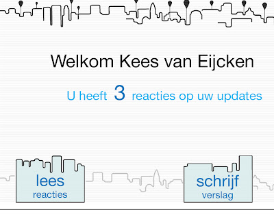
 Display:
  Website:
 The colors were changed to black and white and grey tones, with a hint of blue. The display is more focused on the stories, and the reactions shove by at the bottom simulating a retro-looking illuminated news trailer.
Movie scenario
The movie scenario, we figured, does not need to be to neat and goodlooking. Why waste precious time on something static you just use as a basis for a dynamic movie? So it turned out to be this, scribbled down on a piece of paper (if it had fitted, it would’ve been done on the back of a beer mat).

Task analyses
Rougly, our project could be devided in four different tasks:
- Writing stories
- Reading stories
- Reacting
- Signing up (to become a reporter)
In the beginning, we decided that our pole (UPloader from now on), would be the mothership of our whole crossmedia-concept, everything would be a matter of minor importance. On the UPloader, people could:
- Write stories (only the reporters ofcourse)
- Read stories
- See where balloons are located
- Write reactions
- Read reactions
The displays could show:
- Stories
- Location of the balloon
- Reactions
- Some minor gadgets (e.g. time, actual weather)
And finally, the website would be there for:
- Reading stories
- See where balloons are located
- Write reactions
- Read reactions
- Get extra information
- Sign up to become a reporter
Of course there is also the cellphone, which is used only for texting a reaction on a story.
Yet, after a chat with our tutor, he suggested to make a schedule which shows us the crosslinks (funny!) between the different media, so basicly: show the crossmedia! And so we did.
 We found out then, that if people wanted, only the information pole would be sufficient to experience the project. The only thing they couldn’t do was signing up, but this is only a feature for dedicated users. So we decided to limit the possibilities of the UPloader to:
Yet, after a chat with our tutor, he suggested to make a schedule which shows us the crosslinks (funny!) between the different media, so basicly: show the crossmedia! And so we did.
We found out then, that if people wanted, only the information pole would be sufficient to experience the project. The only thing they couldn’t do was signing up, but this is only a feature for dedicated users. So we decided to limit the possibilities of the UPloader to:- Writing stories
- Reading reactions on own stories (only for the reporters)
This way, a crossmedia interaction is forced upon the participants, which is of course the goal of this course. All the other tasks remained the same. The crossmedia schedules would then look like this:
For the reporters:

For the viewers:
 Task flows
UPloader:
For the reporters:
For the viewers:
Task flowsUPloader:
Display:
We thought a taskflow of the website would not be very interesting, since the main tasks are just clickable directly from the homepage, and a home button is displayed constantly.
Wireframes
Basic wireframes were quickly made to determine the best position of different elements in our interfaces. The final wireframes which are used as a basis for the detailed visual design examples are shown beneath.
UPloader:
Display:
Website: Detailed visual design examples
In the sixth week of the project, we already had to present some detailed visual design examples. This is what we came up with:
Detailed visual design examplesIn the sixth week of the project, we already had to present some detailed visual design examples. This is what we came up with:
Uploader:
Display:
Then there were the holidays. And after two weeks of vacation and clearing our minds, we resumed our project with fresh courage and new visions. And then we discovered the same horrible thing you already saw; our visual designs were ugly, very ugly. What were we thinking? So we gathered around the table once more and started discussing (read: telling each other what was so ugly about it). Until Sam suddenly raised his voice and said: ‘Let’s focus on what we do like about it’, and so we did. We did like the skyline with it’s little balloons, yet it shouldn't be that childish with all the fancy colors, we also did like the simplicity of the screens. With these information, we made the new and final design, which we still like today.Uploader:
Display: Website:The colors were changed to black and white and grey tones, with a hint of blue. The display is more focused on the stories, and the reactions shove by at the bottom simulating a retro-looking illuminated news trailer.Movie scenario
The movie scenario, we figured, does not need to be to neat and goodlooking. Why waste precious time on something static you just use as a basis for a dynamic movie? So it turned out to be this, scribbled down on a piece of paper (if it had fitted, it would’ve been done on the back of a beer mat).
Geen opmerkingen:
Een reactie posten