In our posts on the 20th of November and the 9th of December we've already mentioned some potential participants and made them less fictive by giving them a name and a live, sketching a so called “scenario”. In order not to repeat ourselves we would like to redirect to that posts when you’re feeling an urge to gain more info on that subject.
Visual Style
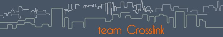
Throughout the weeks of this project team CrossLink has undergone several visual changes (see: brand identity) in house colors, font types, logo's and even a switch of blogname (and provider) These facelifts had us eventually at a position in which we all agreed into our final design. We'd carried out this design, the skyline, throughout merely everything we delivered, in an attempt to carry the function of a “logo”referring to team CrossLink and the UP project. The skyline resembles citylife and/or the skyline of delft along the spoorzone project, an image known to everyone who enters the city over the railwaybridge. A little later in the proces we added the balloons in our logo. The fun of this element is that the amount of balloons can indicate the stage in the process/participation, e.g. an empty sky would resemble the start and bit by bit adding balloons would show activity within the project.


 I would like to mention the creation of our moodboard in short and perhaps motivate the reason a little.
We've tried to embed the total concept/idea of this project into one single picture, a so called “moodboard”, unfortunately we've noticed some disturbance and had people confused or not getting the underlying message it contains. Therefore, we'll underpin these images with actual words in another attempt to share our vision on this moodboard.

Technical issues
This is a paragraph of great importance when looking at the feasibility of this project.
With the introduction of CMID one of the first questions we asked concerned credibility. We wondered how far we could go in terms of embedding technological breakthroughs and futuristic solutions. Where does our imagination conflicts reality? We were given the feeling that we were free to judge for ourselves, however as a group we decided it would be a greater challenge trying to keep the concept down to earth.
However, during the process we bumped into some inevitable problems or possible threads/issues to the concept as it is designed. Most of the issues were noticed by ourselves, and we decided in within the group whether to adjust it or simply not to bother. Some of the issues were mentioned by “third” during the interviews. We'll briefly pass by the main concerns of this project:
Reporters
We select a group of approximately 6 elderly to play the role of a reporter. We tend to forget we're working with 65+ of which most of them don't have an experienced background in IT. In order to make sure the reporters know what their mission is and how to accomplish, we might want to introduce them to UP's digital interfaces through some training process. This might seem as a huge liability, but we believe it's not impossible. As a matter of fact, when we succeed in training these elderly into working their way around our CMI, it would tackle this prejudice we so easily assume to expect. It would show the “younger” people of Delft what these elderly are capable of and would win credit. At the same time the elderly would gain confidence and perhaps lower their fear of using other electronic equipment like mobile telephones or personal computers to e.g. communicate with family elsewhere.
Balloons
As illustrated in the picture there is actually a fully automatic balloon inflator on the market, and so we believe it's not impossible to integrate this into our uploader. However we do expect a lot of difficulties (apart from maintenance) when putting it to the test. Userfriendlyness might be a problem and since the balloon also have to be attached to a piece of string, extra features might add up extra functions to be taken into account for. Coming to think it, we also want to fit a tiny LED to the nozzle of the balloon, lighting it up at nighttime. Once again, we have proof of existing solar powered LED-Balloons on the market, but once again, this function has to be integrated into the fully automated inflation procedure. Not to mention the estimated flight duration of an ordinary balloon is nearly a day. However, weather balloons, made out of thicker fabrics, can stay UP for months without deflating. Proving again that nothing is impossible.
The only inevitable problem we're dealing with is the potential risk of vandalism. Since reporters mark locations along routes along the public space of the building site, everyone is able to reach out for these balloons, cut them loose, tear them down or do other horrible things to it. A somewhat complex solution would be “VIP” access to building sites restricted areas for reporters only, in order to make sure that balloons are lift UP at points where they are safe from vandalism.

Geen opmerkingen:
Een reactie posten